The Jelly Balms
The Brief
Campaign Identity
Campaign Strategy
Art Direction
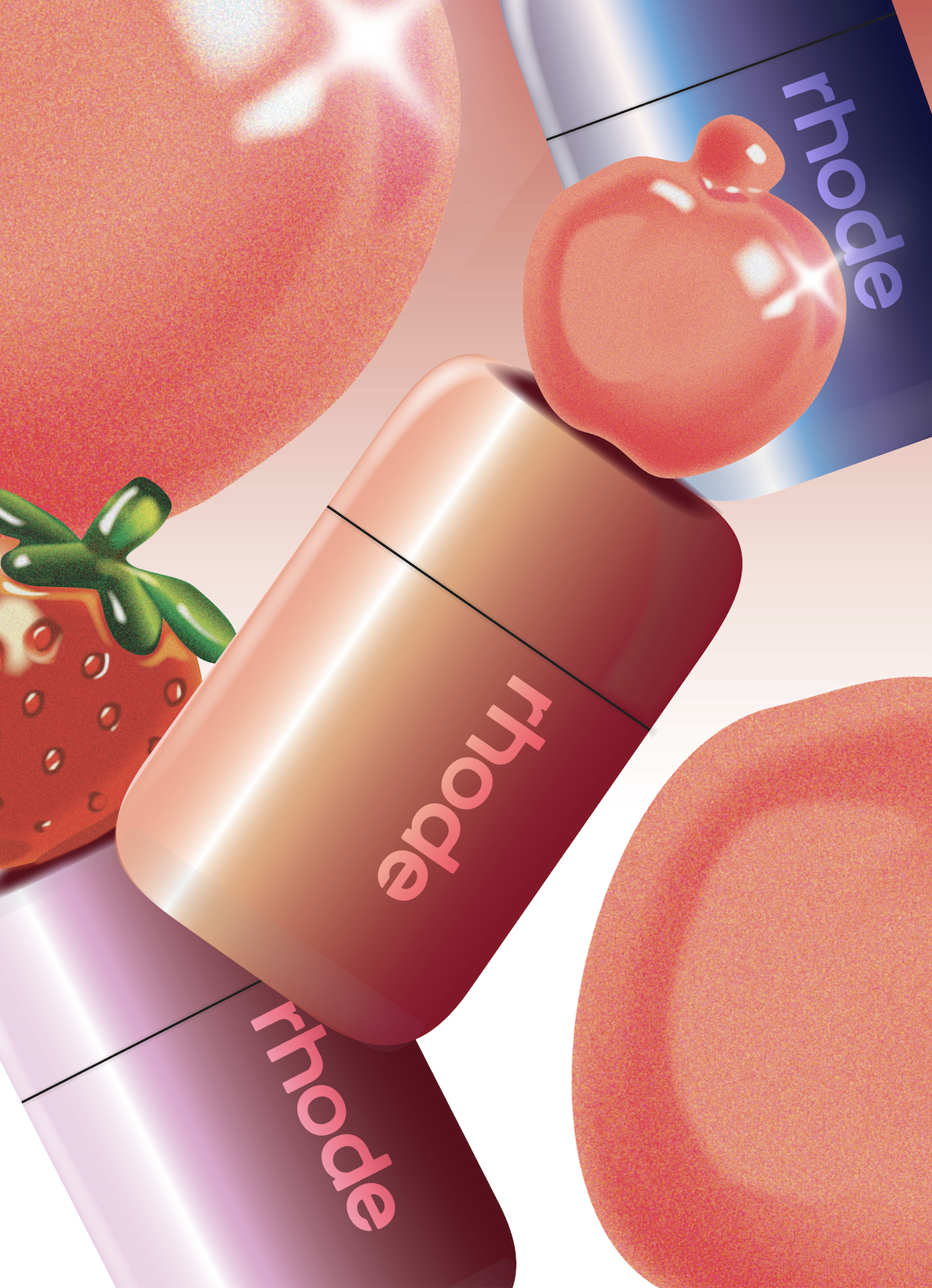
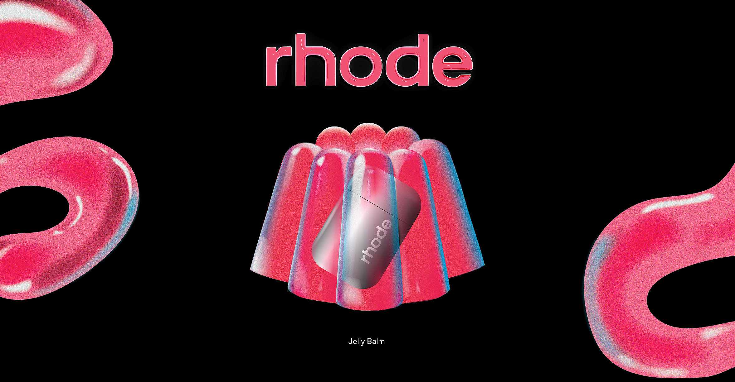
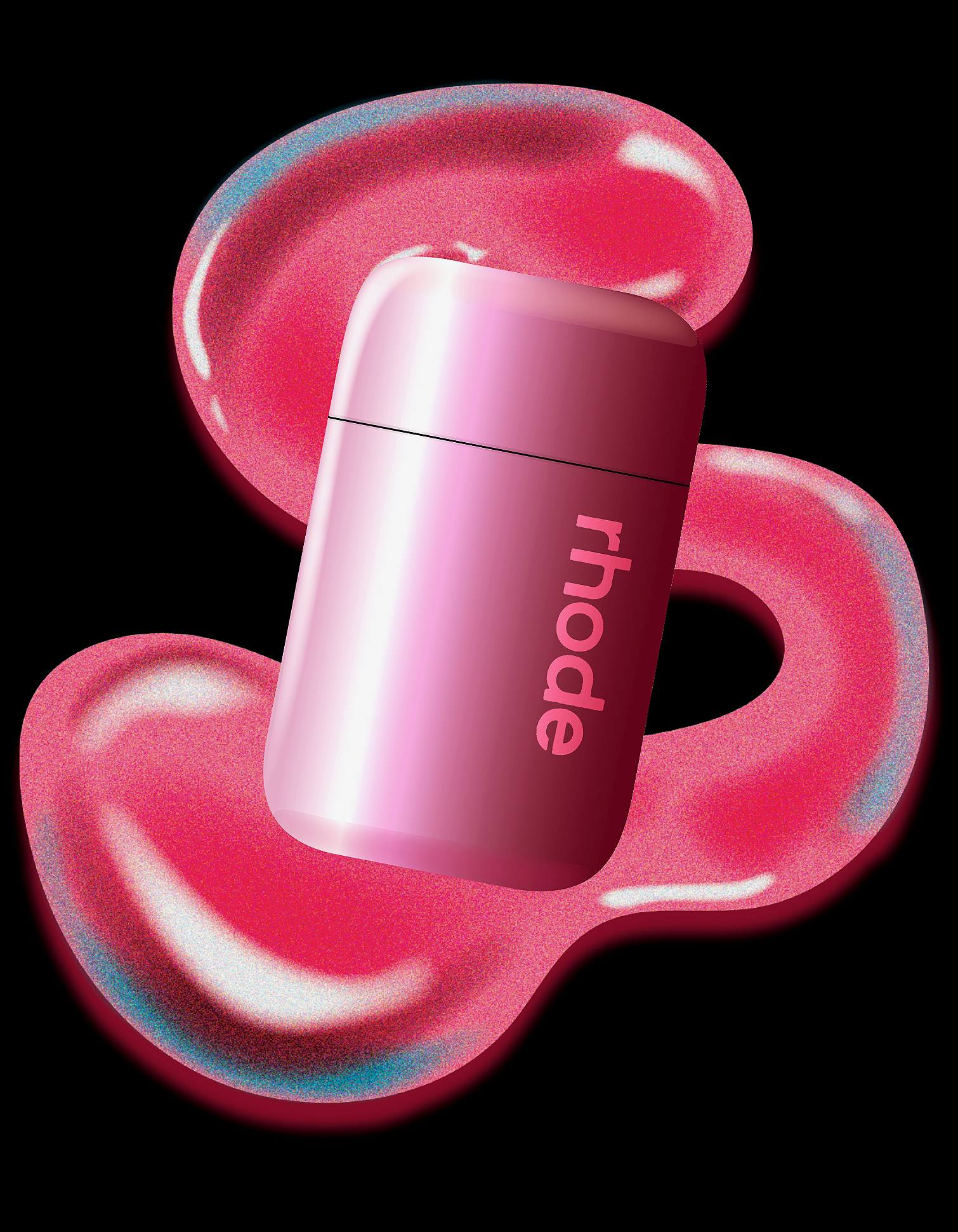
Rhode is known for bringing a sense of playfulness to its creative work. Their campaigns were always showing up on my feed, pairing strong editorial photography with unexpected creative direction, so I challenged myself to develop a creative direction for a fictional product: the Jelly Balm.
The look is inspired by retro Photoshop design, with reference to Robert Beatty's layered aesthetic. The Illustrator file for this brief is no joke; each image has about 100 layers stacked up. Accumulating precise layers made everything so customizable, which unlocked a lot of design freedom (I now can put anything in jello). It was a fun way to push illustration, explore new visual techniques, and build a campaign that feels playful from start to finish.
This project was an opportunity to explore the more artistic side of advertising and to create a campaign from a visual arts perspective.
-
![]()
The Gummy Icons
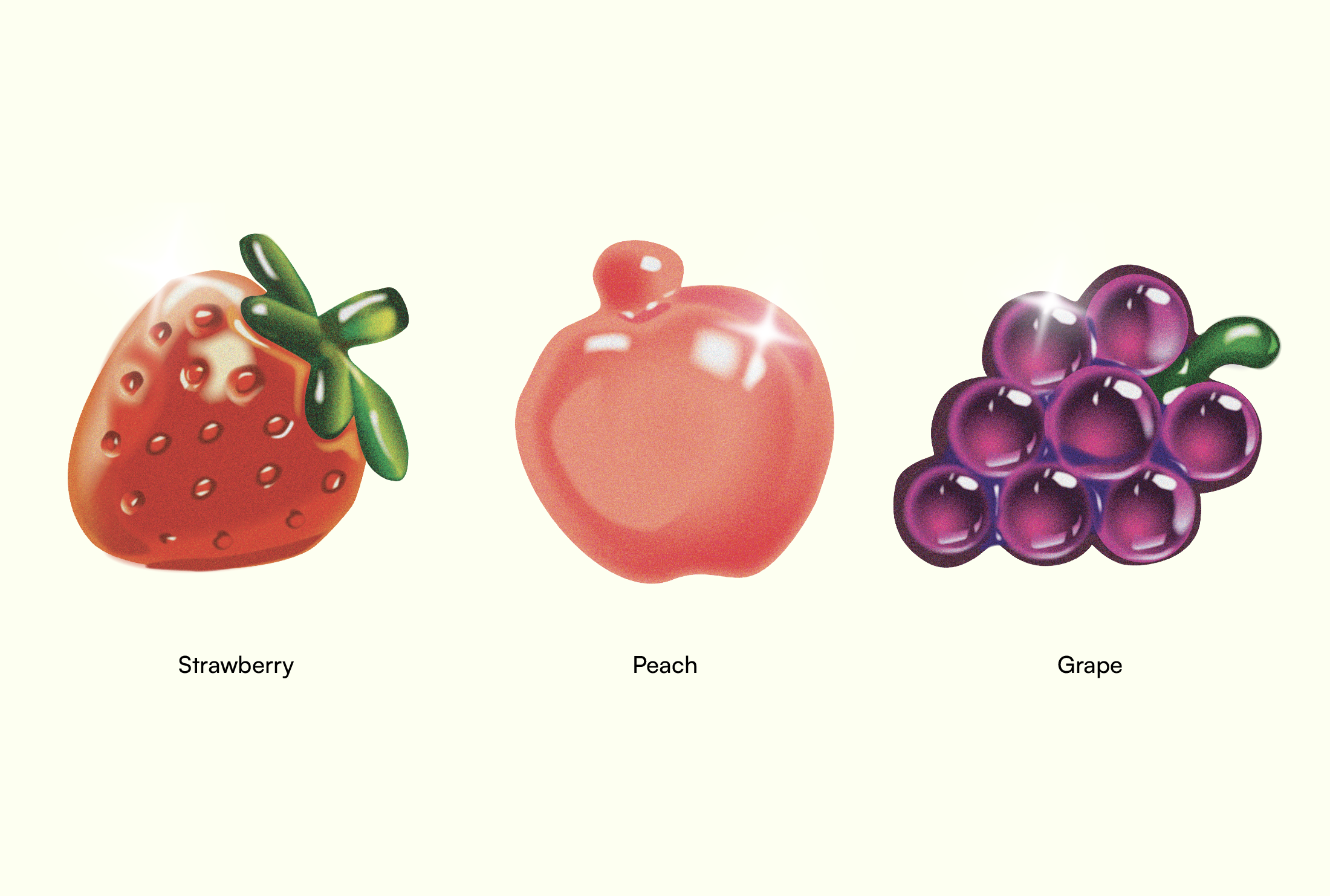
The gummy graphics combine the indulgence of a sweet treat with the fresh appeal of a new skincare product while also keeping the “jelly” theme.
-
![]()
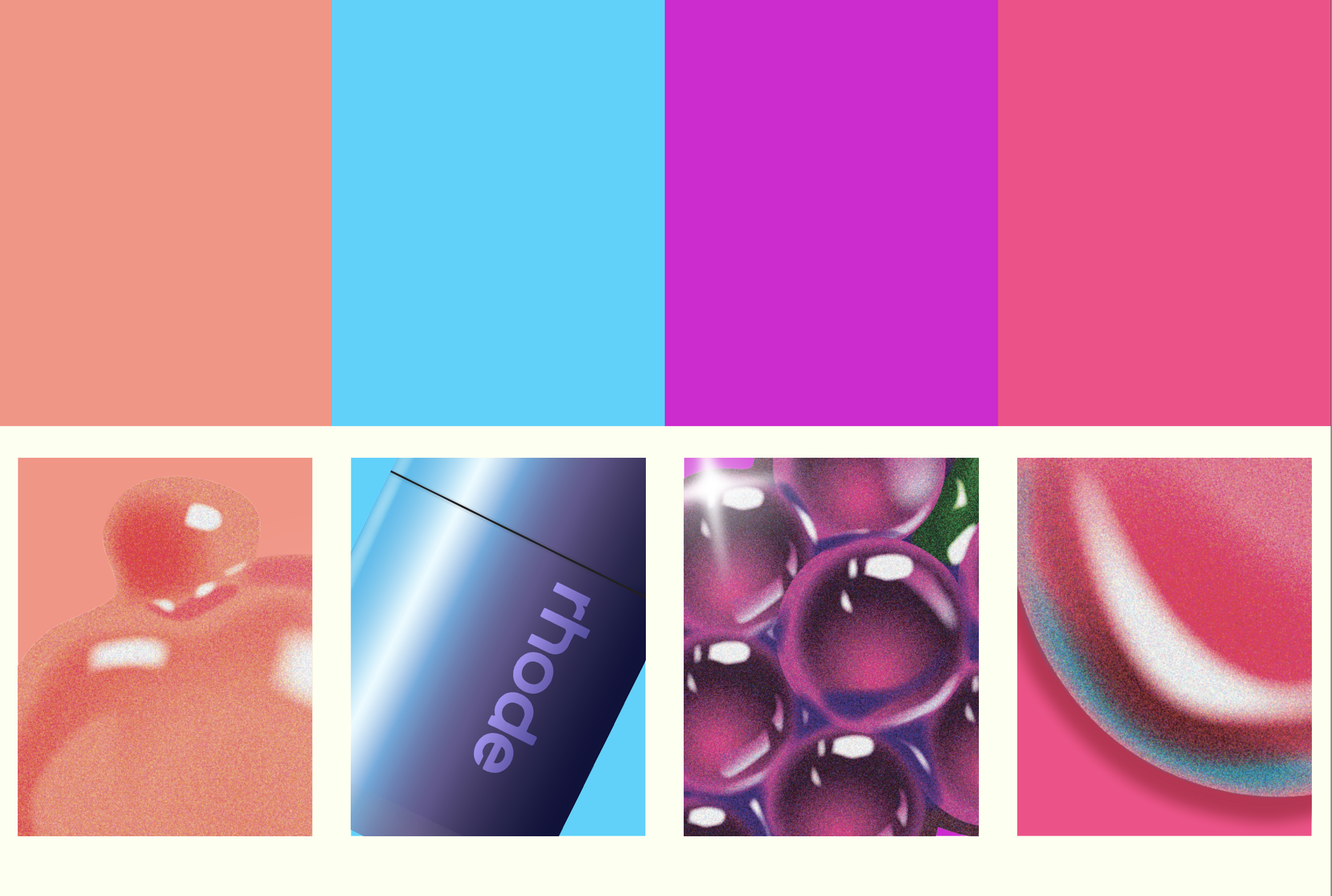
The Color Palette
I wanted the color palette to feel fun and flavorful, using warm tones complemented by a bright blue accent to create contrast and vibrancy.
-
![]()
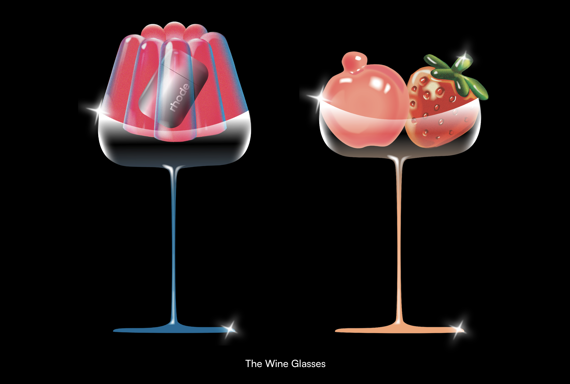
The Complimentary Illustrations
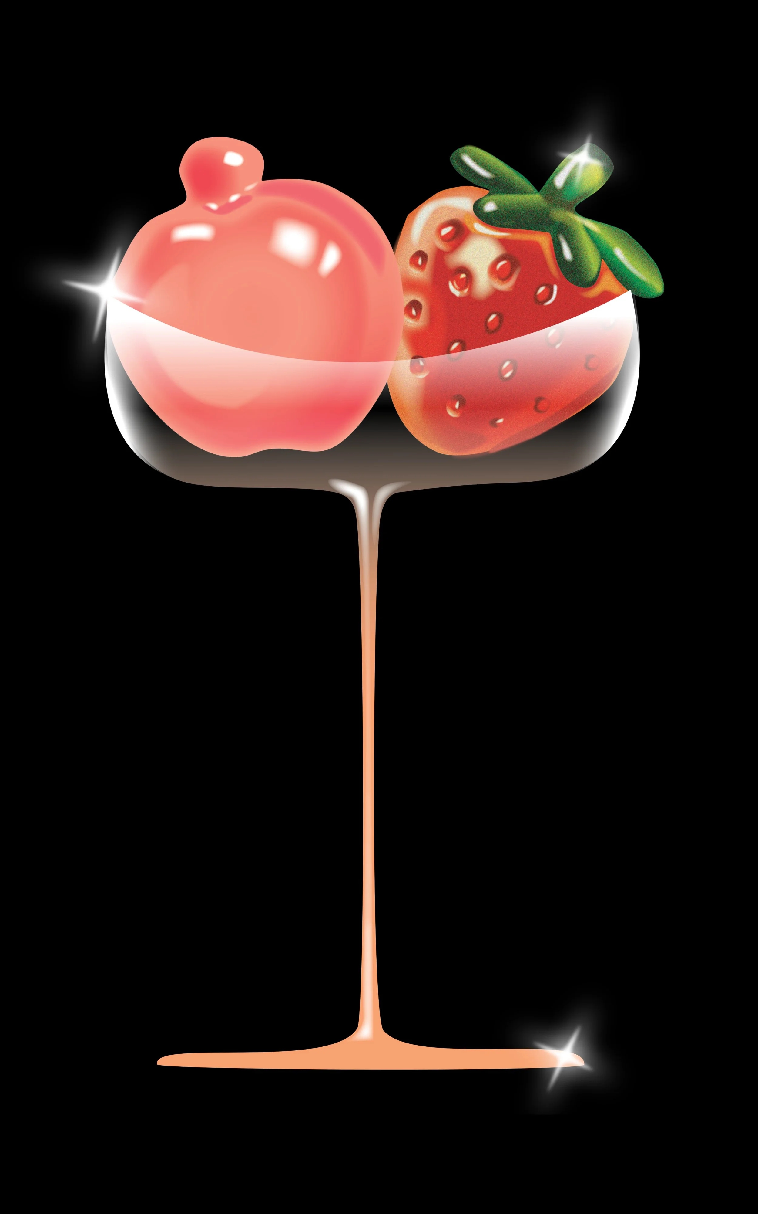
Wine glass illustrations to reinforce the self-care ritual, suggesting a relaxing and luxurious experience.
-
![]()
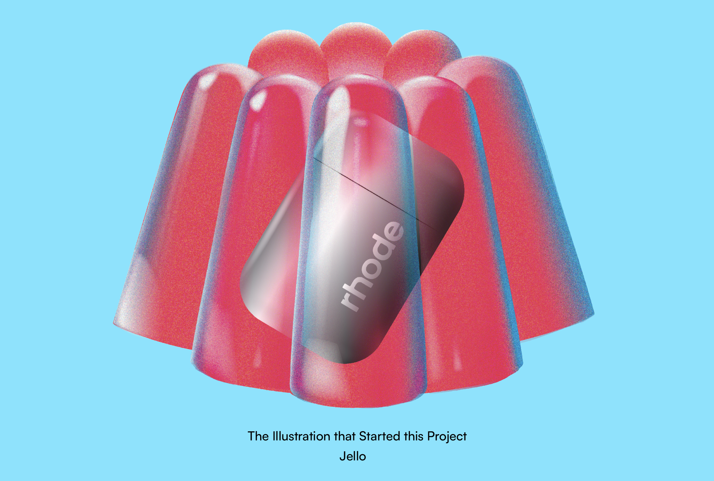
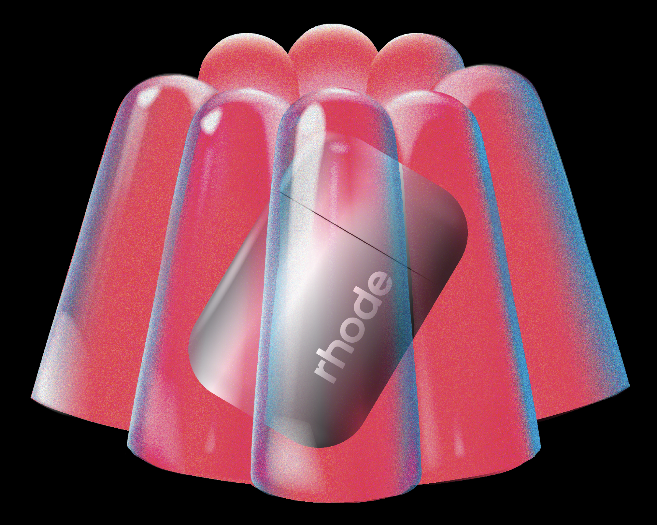
The Jello for the "Jelly" Balm
This was the first illustration I created, and it served as the foundation for the overall theme of the campaign.
-
![]()
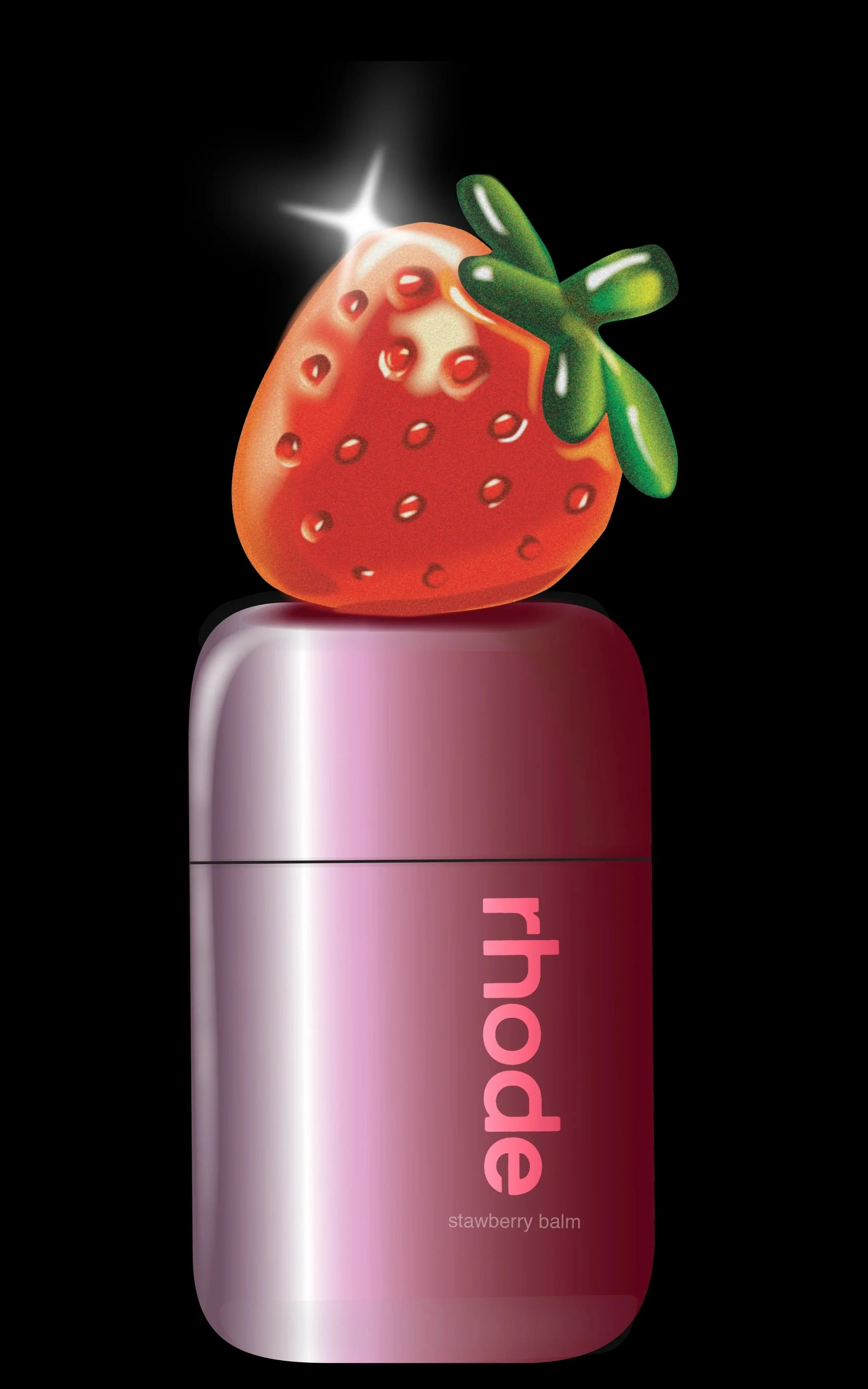
Strawberry Jelly Balm
A strawberry gummy to add some decadence.
-
![]()
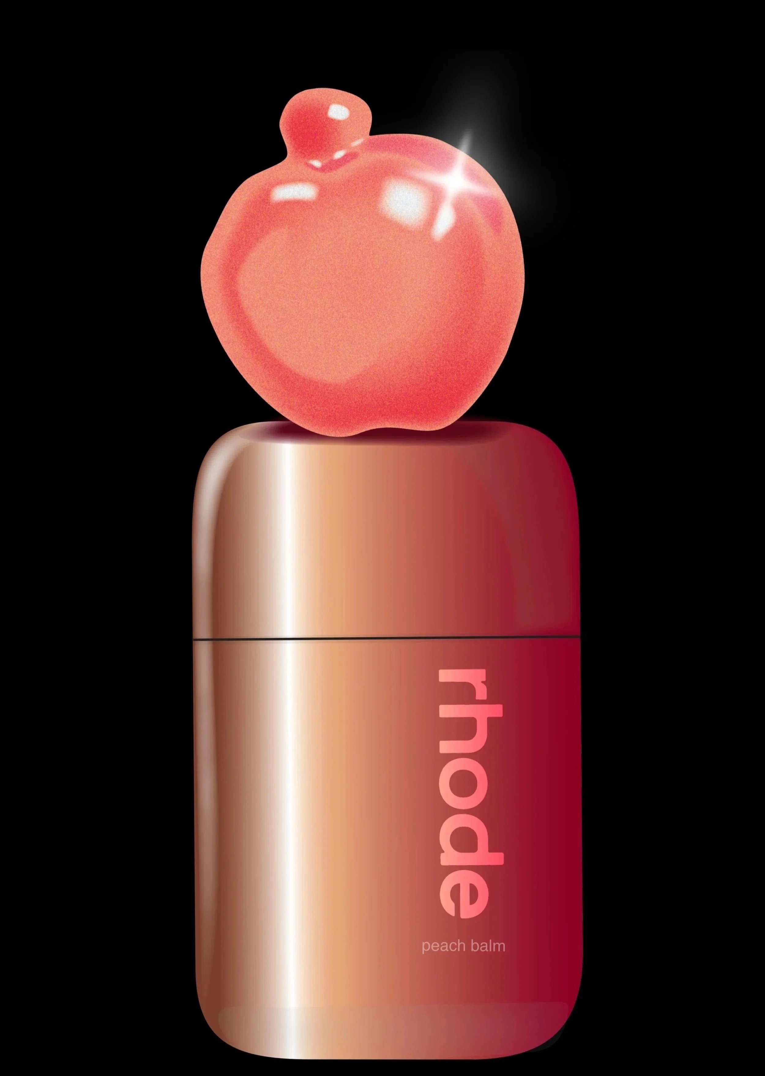
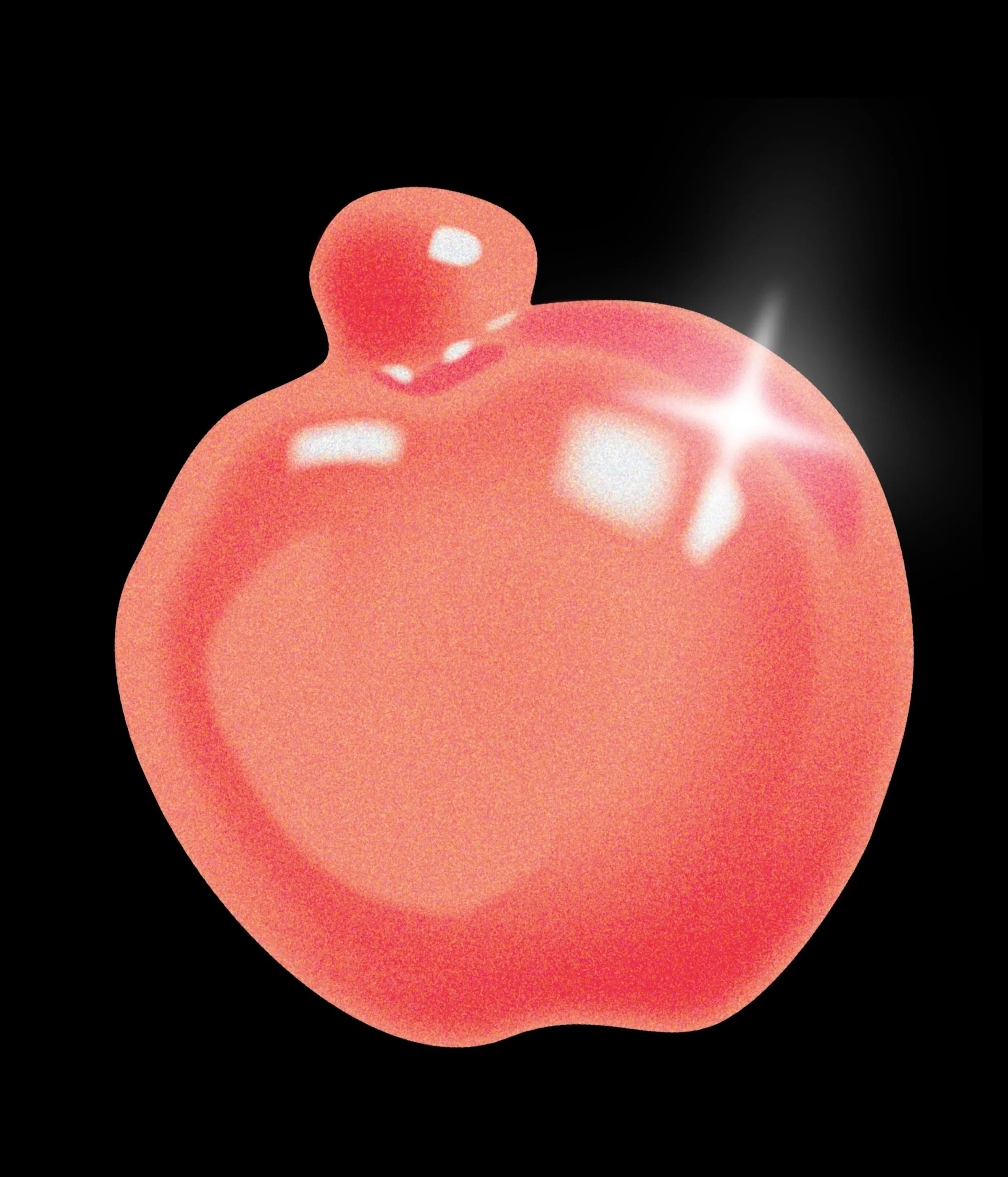
Peach Jelly Balm
A peach gummy for the fruit lovers
-
![]()
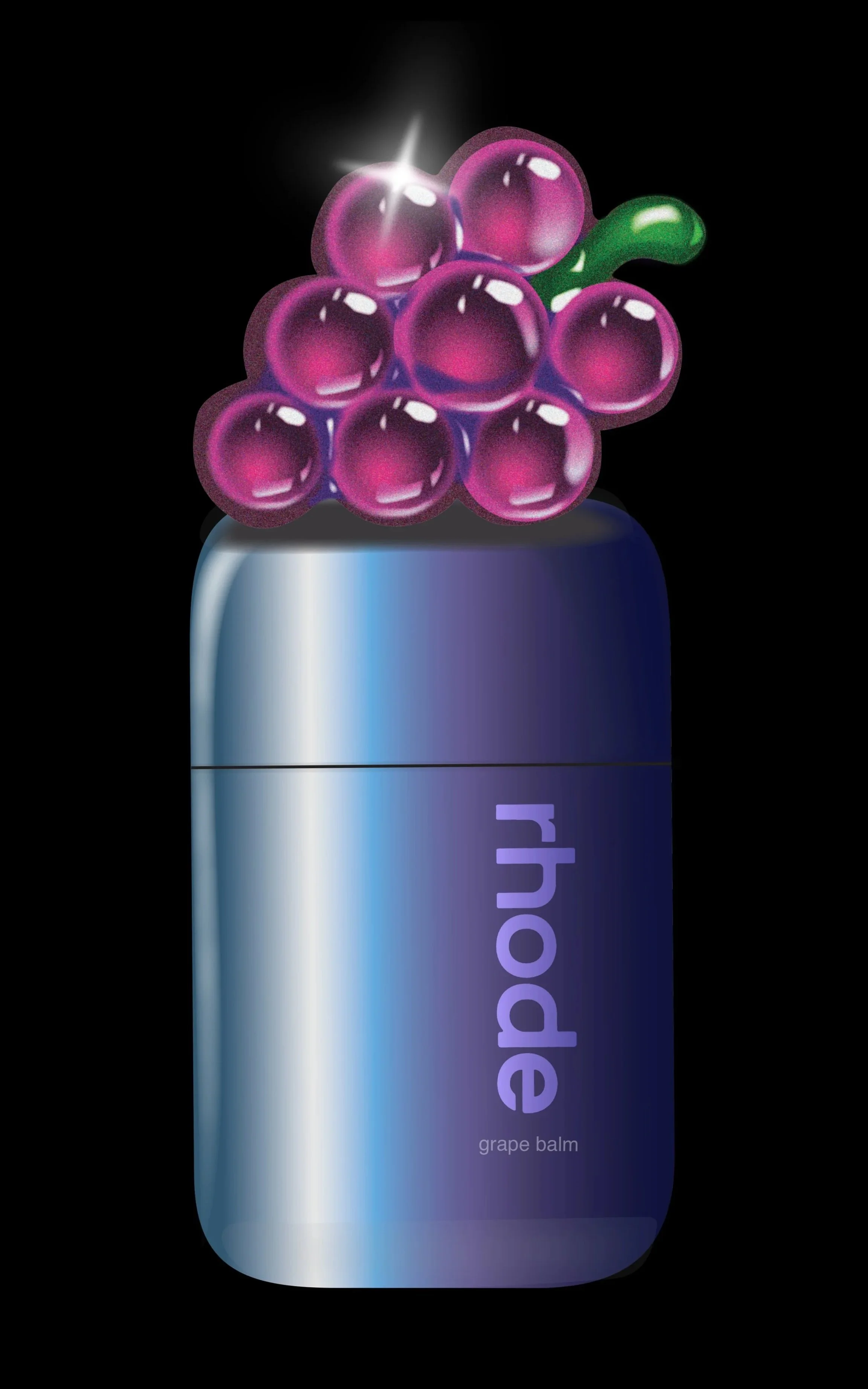
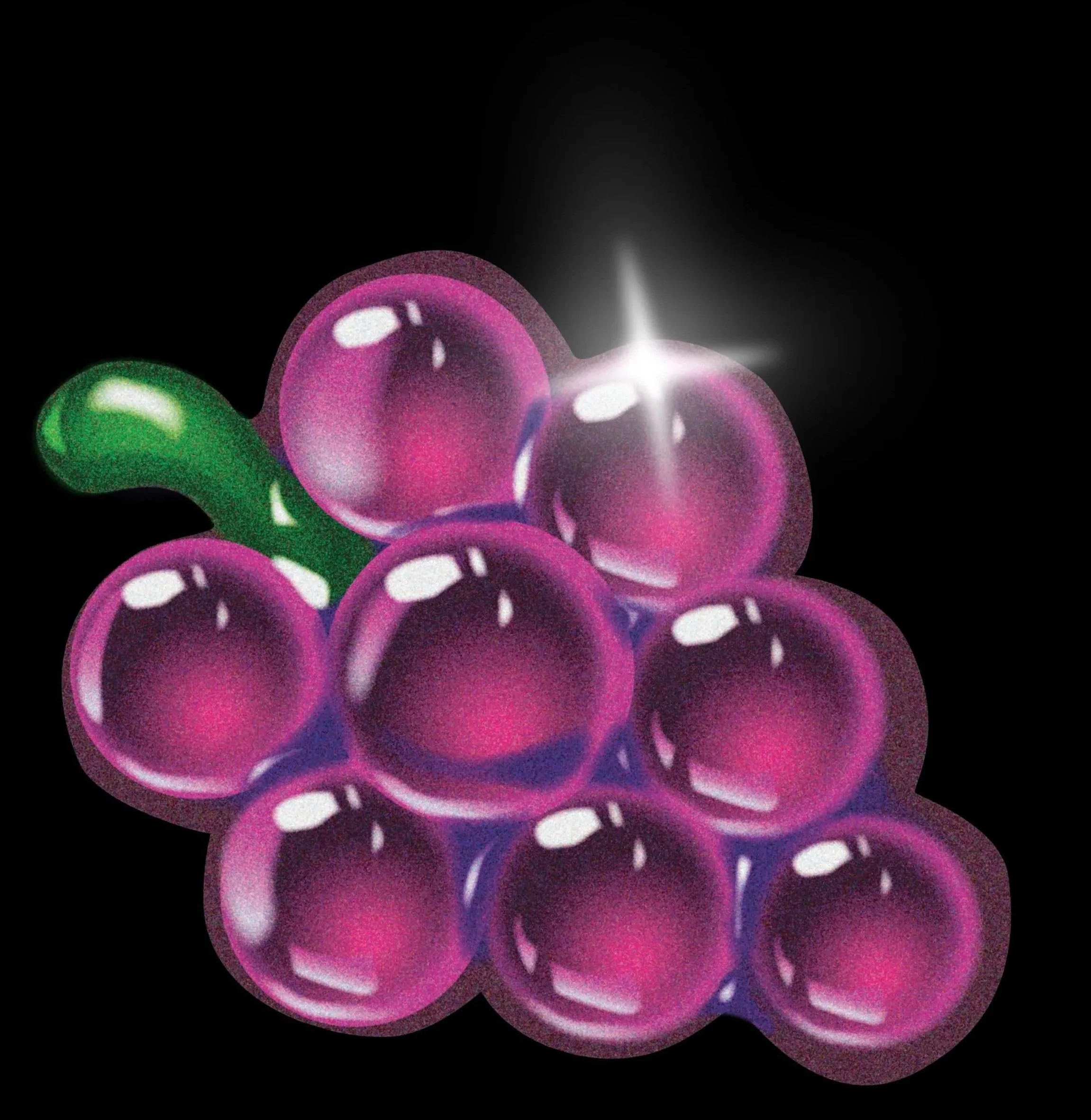
Grape Jelly Balm
Grape. The most hydrating of the berries.
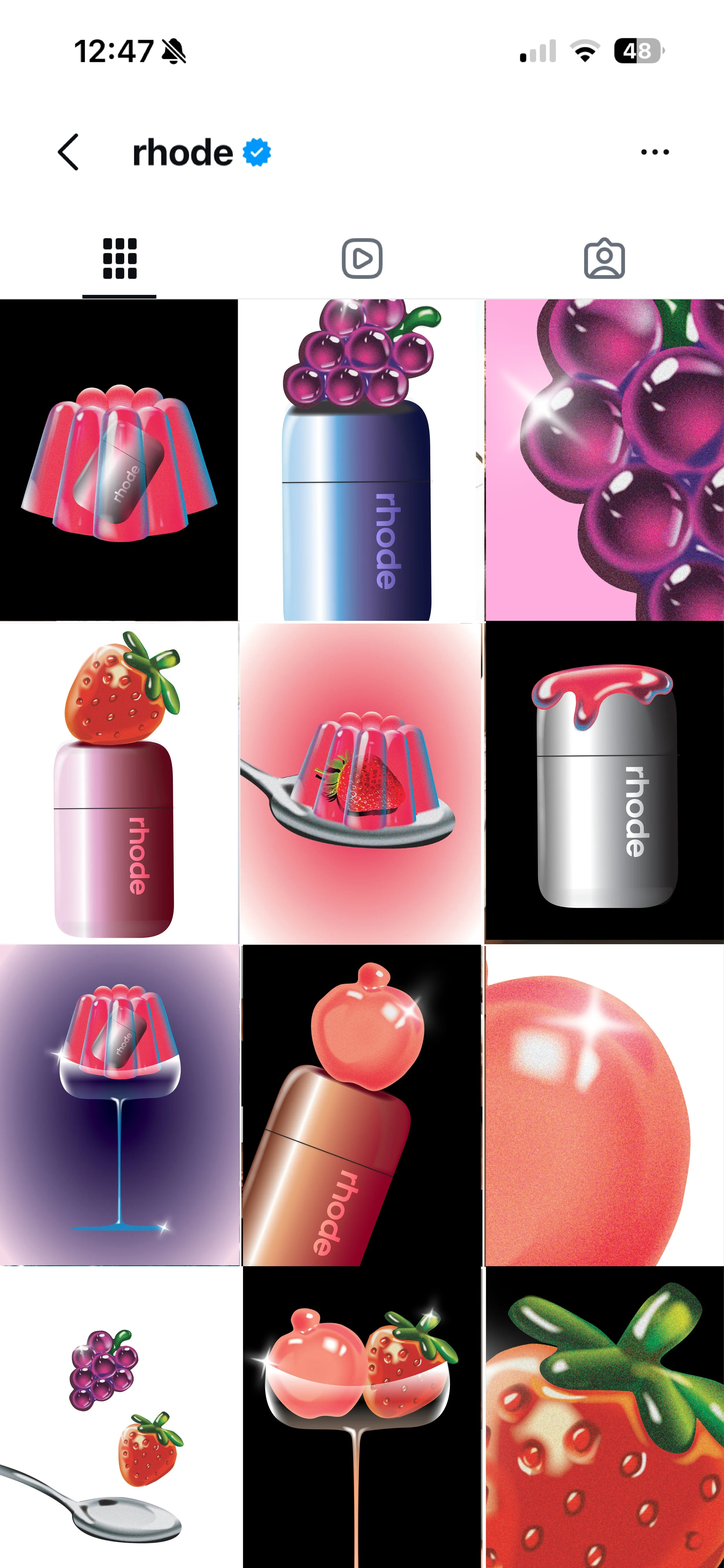
Content creation for Instagram.
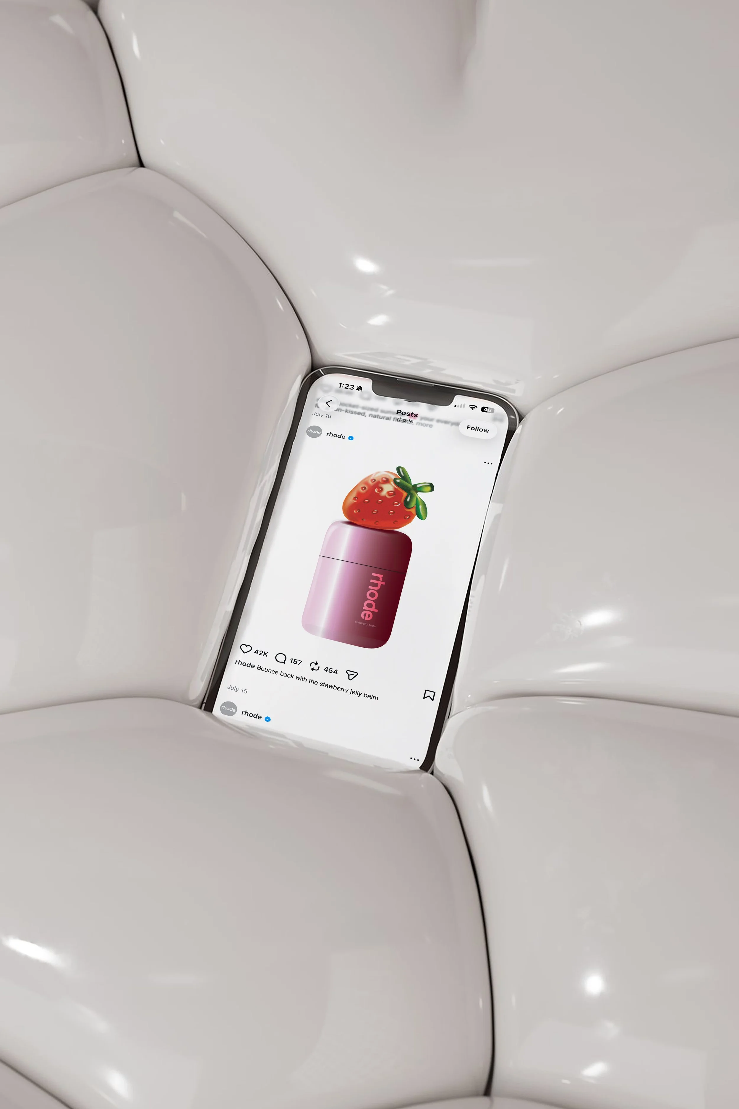
Feed check.
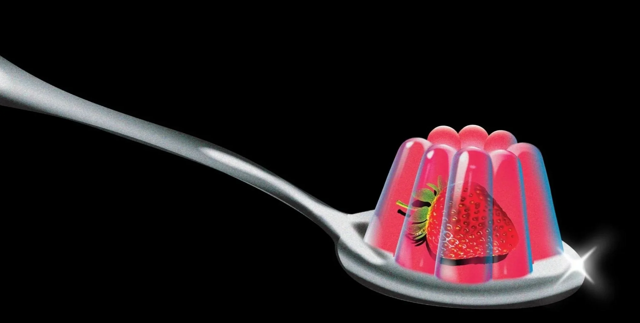
Sweet Treat.
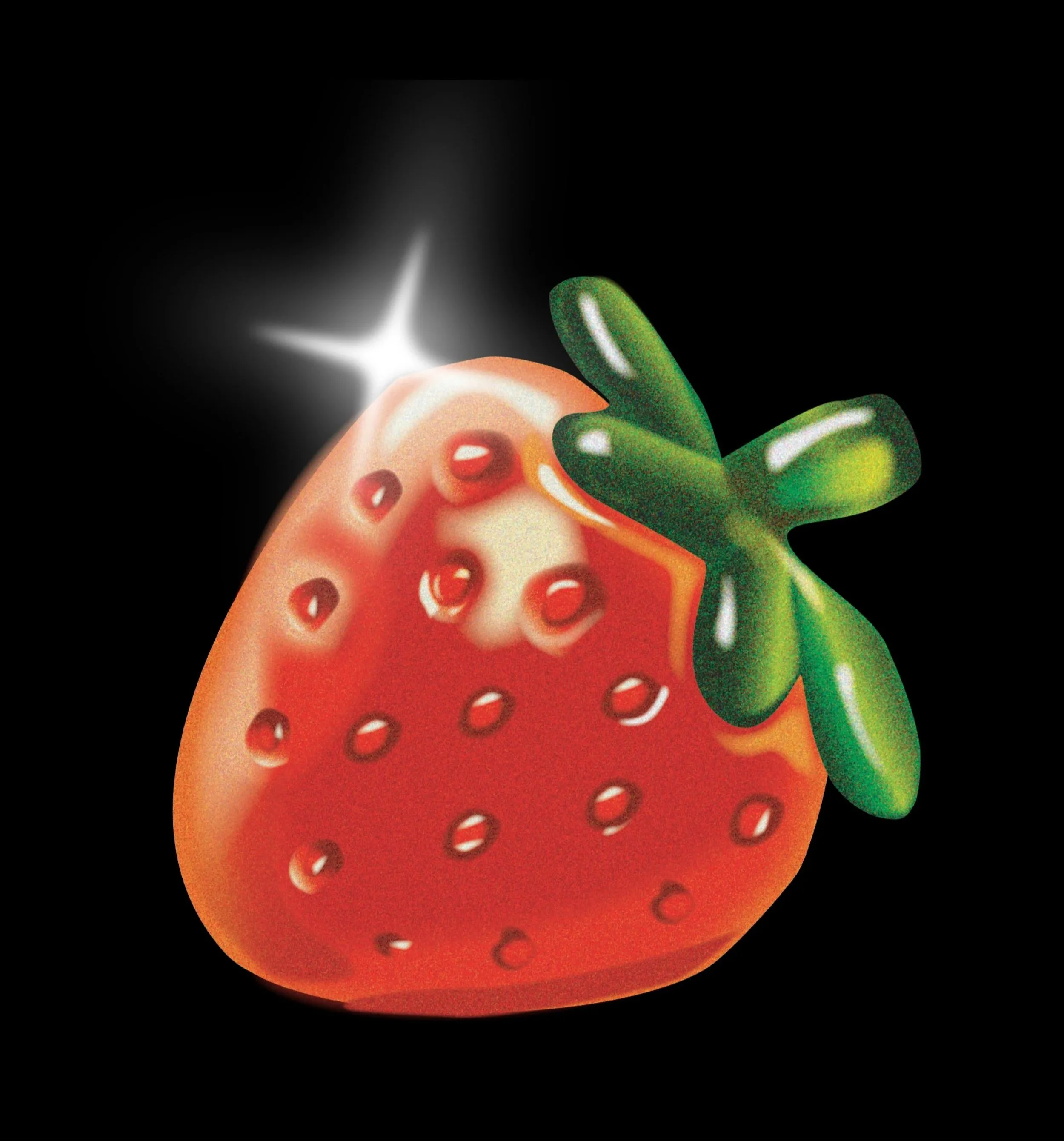
glass skin.